Opt-In Module
Adding an Opt-In module allows users to opt-in or out of your marketing content. It can only be used in a form section.
Once added to your form, click on it to begin editing.
Settings
Use the settings tab to update the copy, define the scope, and choose the consent type and presentation style.
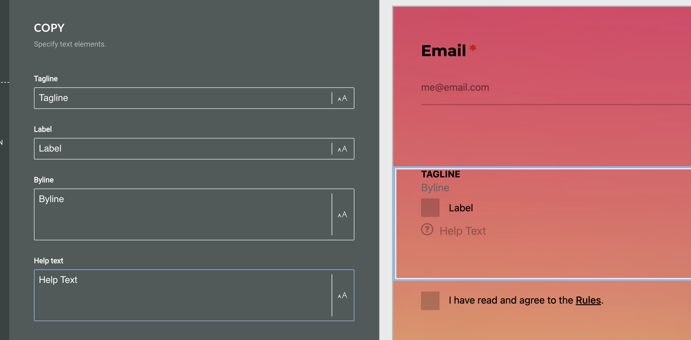
Copy
Under the Copy heading, you can define the following fields:
-
Tagline
-
Label
-
Byline
-
Help text
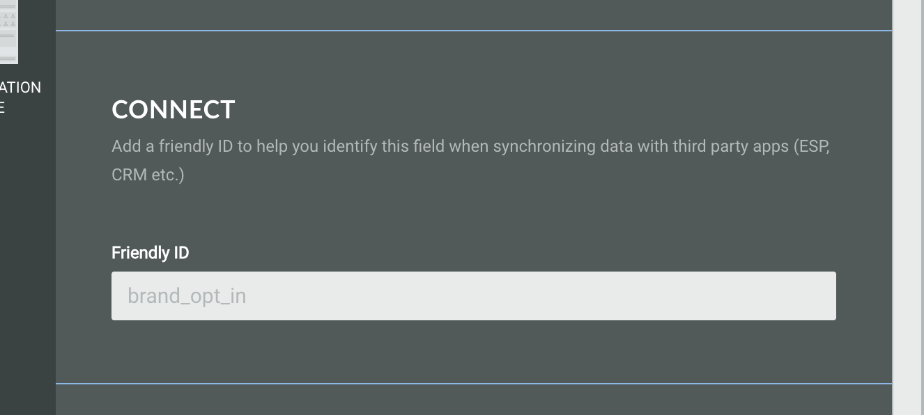
Connect
You can add a Friendly ID to help you identify this field when synchronizing data with third party apps (ESP, CRM etc.)
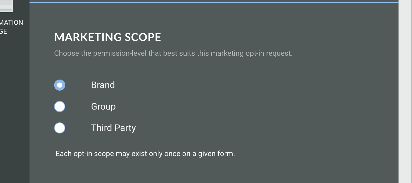
Marketing scope
Choose the permission-level that best suits this marketing opt-in request. Choose from:
-
Brand - Consent is given to a single, clearly identified brand. The user knows exactly who will be contacting them.
-
Group - Consent is given to a defined group of brands, often within a category or set of partners. This allows users to hear from multiple relevant organisations.
-
Third party - Consent is given to one company, which may share it with partner organisations. This enables a wider range of brands to connect with interested audiences
Note: Each opt-in scope may exist only once on a given form.
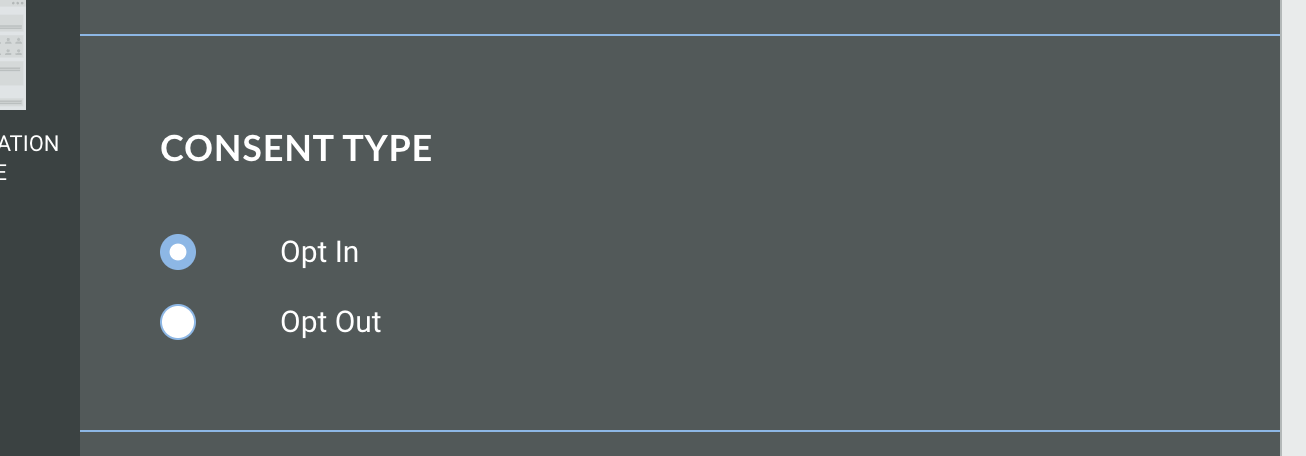
Consent type
Choose whether you want the user's action to result in them opting in or opting out of your marketing content.
For example, by choosing Opt Out, the user will need to check the box to opt out of your campaigns.
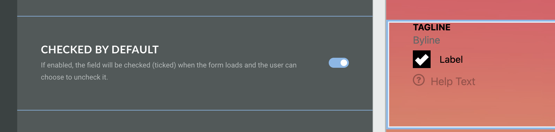
Checked by default
If enabled, the field will be checked when the form loads and the user can choose to uncheck it.
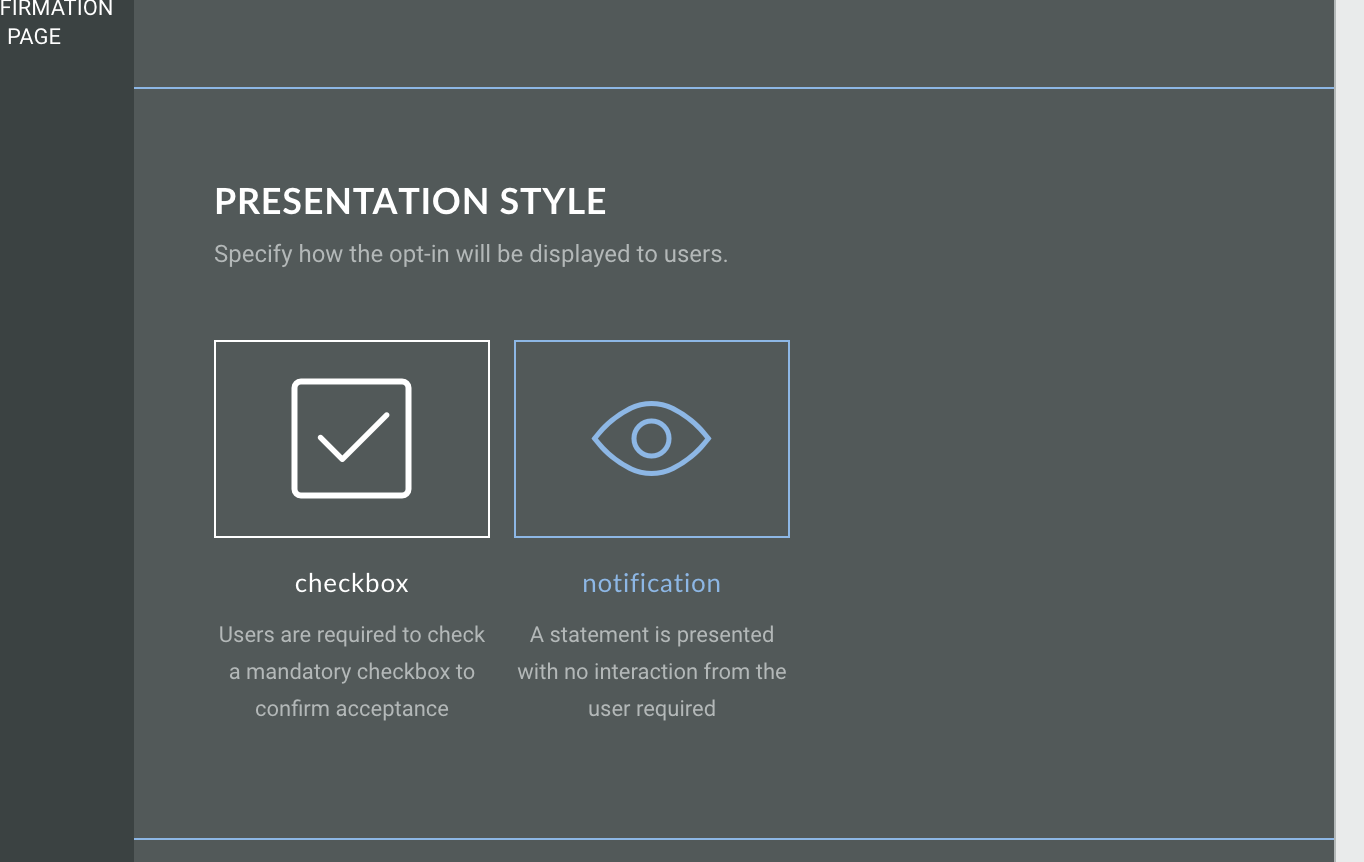
Presentation style
If you have enabled checked by default you will be able to select the presentation style. Choose from:
-
Checkbox - users are required to check a mandatory checkbox to confirm acceptance
-
Notification - a statement is presented with no interaction required from the user
Design
The design tab allows you to assign a CSS class name and toggle the slide transition on/off.
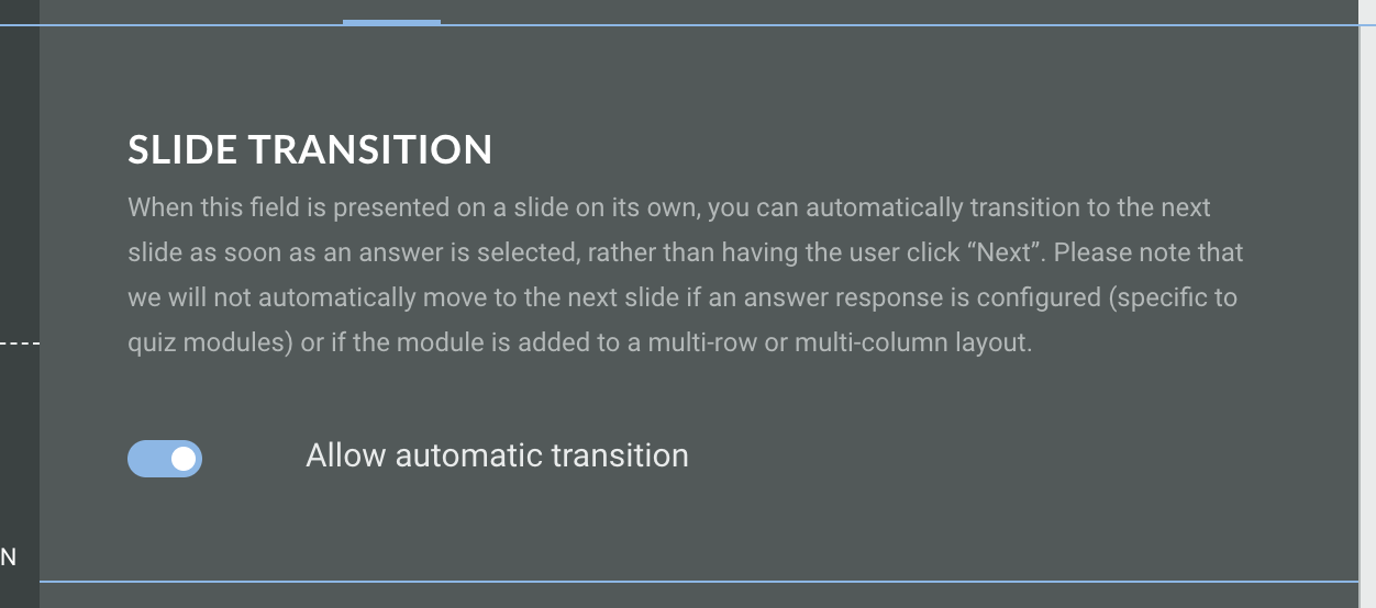
Slide transition
When the opt-in field is presented on a slide on its own, you can toggle this option on which will mean the slide will automatically transition to the next as soon as an answer is selected, rather than having the user click Next.
Note: It will not automatically move to the next slide if an answer response is configured, such as to enter an email address, or if the module is added to a multi-row or multi-column layout.
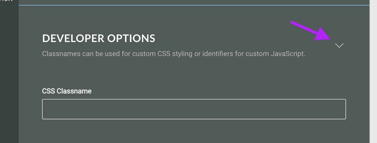
Developer options
Click the triangle to expand the developer options. Here, you can assign a CSS classname to the module for using custom CSS styling.
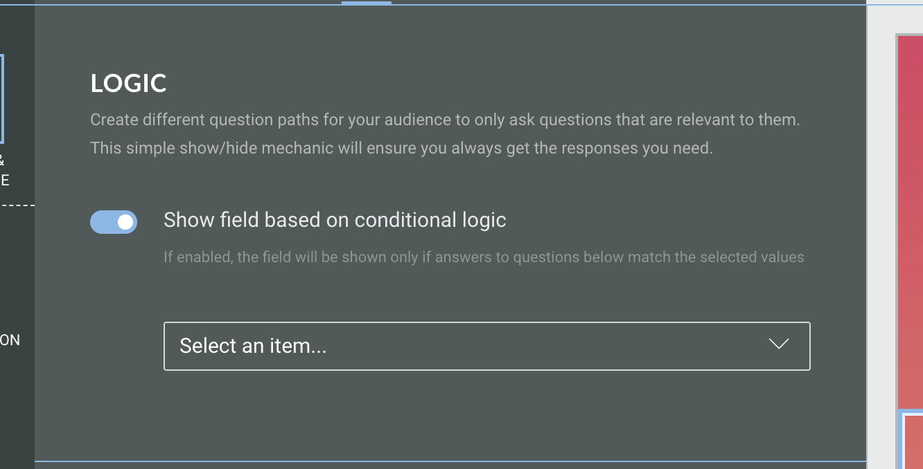
Logic
On the Logic tab, you can create different question paths for your audience to only ask questions that are relevant to them. This is based on conditional logic determined by answers given to quiz questions in this Experience.